


Men, as we know, are quite rigid when it comes to wearing colors. The palette of neutral tones already has everything needed to cover the clothing requirements of every season, and the only real color many men experiment with, against their better judgment, is blue: if they were as bold with the rest of the color spectrum as they are with certain cobalt blues for their suits, we would live in a different world. Be that as it may, in the latest season of runway shows and presentations, almost every brand proposed a solution very appropriate for the summer season, namely the “sorbet colors”.
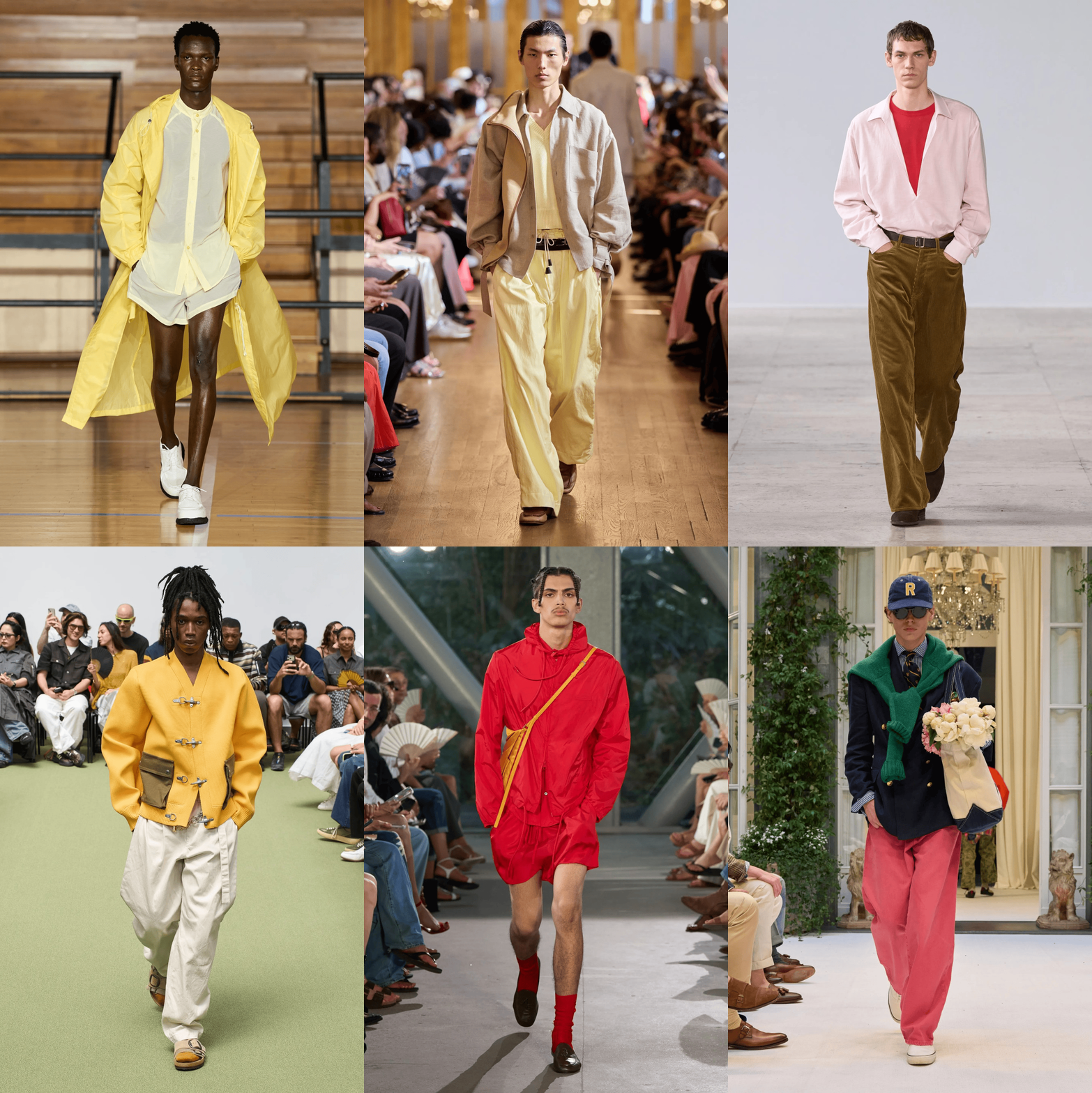
These are a family of vibrant and fresh colors that evoke the freshness of fruit sorbets. Some of them are pastel colors in every sense, others are not exactly pastel, but they all share a consistently bright hue. From lemon to raspberry, passing through pistachio, mint, mango, peach, watermelon pink (which those more versed in preppy aesthetics will identify as “Nantucket Red”) and finally the shades of orange, blueberry, and strawberry, these colors are saturated, luminous, and, to use an imprecise but expressive term, very sugary. But where did we see them this season?
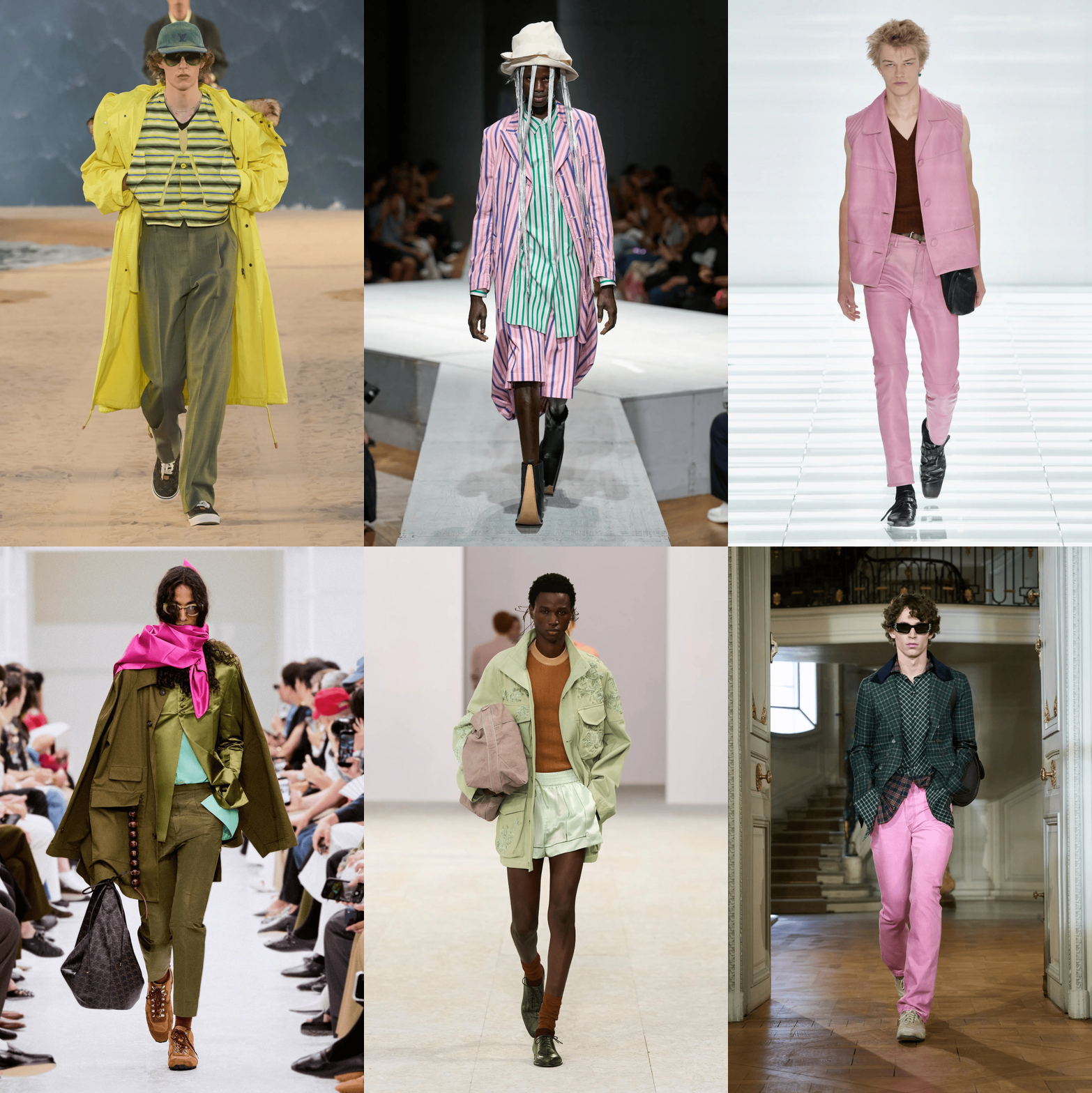
It all started in Milan when, on Prada’s very black-and-white runway, the rigor of the palette was interrupted by a series of pink, light green, and lemon yellow leather sets. Other splashes of color in the show included true yellows, fuchsia, and bluish purples. A similar trio was also seen at Saint Laurent in Paris, where, halfway through the show, three looks appeared with tailored trousers and waterproof jackets in mango orange, mint green, and again lemon yellow. Nor were black cherry sweaters, antique pink shirts, and even a lime-colored top under a gray suit missing here.
In homage to the preppiness of Nantucket Red (a model invented by Murray’s Toggery Shop in the 1960s — red trousers that faded into a dusty pink) and the American tradition of go-to-hell pants, Jonathan Anderson at Dior put these candy colors in several trousers in his men’s show. Meanwhile at Louis Vuitton, Dries Van Noten, and also Celine, there was a lot of play with shades of green ranging from mint to pistachio. Also in the shows of Dries Van Noten and Celine, these sucrose pastels were very present as splashes of shocking pink or red, but also in more delicate shades.
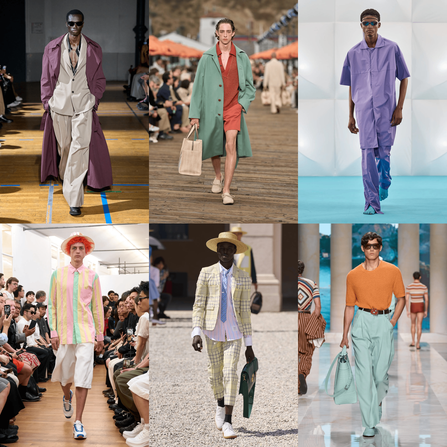
At Willy Chavarria and IM MEN strong shades of strawberry pink were also seen, while other softer pinks, almost milkshake-like, appeared at Comme des Garçons Shirt, Thom Browne, and Ernest W. Baker. Some, like Zegna and Dolce&Gabbana, experimented a lot with these shades this season, pairing the cooler mint tones with more or less burnt oranges. Others experimented with purple, as at LGN Louis Gabriel Nouchi; at Egonlab, where a men’s suit with short sleeves and legs in light purple was seen; and even at Kiko Kostadinov, who included a kind of delicate lavender in his techwear collection.
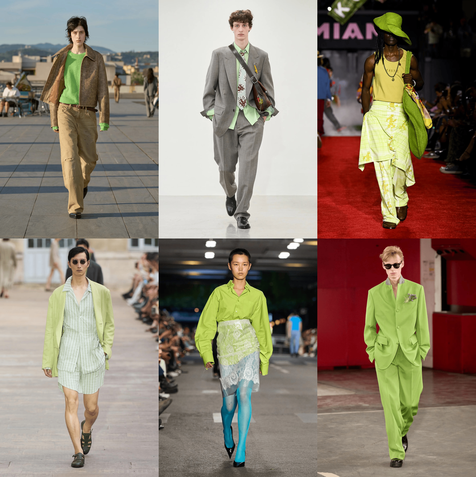
Elsewhere it was the dominion of greens, and especially kiwi, which so many used, like Saint Laurent, to animate suits with unexpected combinations. Sunflower in Florence, Auralee and Paul Smith all used a bright light green sweater to animate suits or paired it with an extremely intense light blue. Vetements used the same green-with-light-blue trick, while Junya Watanabe, Soshiotsuki, Kolor, and Amiri preferred almost the same pure green.
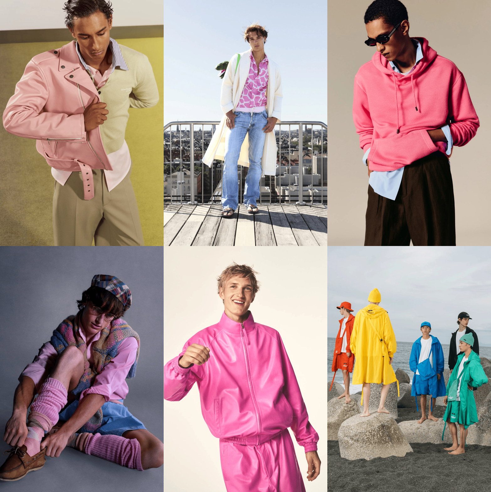
Among the presentations, there was obviously the champion of sorbet colors, ERL, who built an entire collection on vivid pink and pistachio green paired with light blue; but also Givenchy, which, in addition to a light yellow coat, recreated the leather tracksuit worn by Timothée Chalamet in unsuspicious times in such an intense bubblegum pink that it hurts the eyes. Always pink, but lighter, and banana yellows were seen at Acne Studios and Lazsloschimdl, while Undercover closed with a group of very colorful waterproof capes in its SS27 lookbook. Isabel Marant’s closed with a watermelon red sweatshirt, while the more caramel-like shades of pink appeared both in the Hermès collection and in that of Umit Benan.
As mentioned at the beginning, the vast majority of the men’s market does not like to experiment too much with colors. And all brands know this, including those in mass distribution. Just open the homepage of Zara, for example, to see that the brand’s summer collection features perhaps two shocking pink tops, a butter yellow t-shirt, and another purple one. In general there are bright colors, but it wouldn’t be wrong to say that 80% of the total is made up of white, black, blue, and beige.
The logic behind this mix is that men will always tend to buy those more familiar colors and therefore it would be a waste. Color is thus used in smaller quantities but, precisely because it must stand out, luxury uses that minority of colored pieces as a positioning tool, not as a commercial bet. Even if Shein works with intense colors, a certain precise shade, with that specific rendering, is simply irreproducible at certain price levels. The emerald green of a Prada leather suit is not “a green” but the result of a specific tanning and material, of a dyeing process that no fast fashion supplier can replicate.
The precious fiber holds color differently from cheap cotton or polyester, returning a saturation and depth that simply do not exist as an option elsewhere. That precise shade, with that precise rendering, is materially available only to those working at a certain level. In this sense, the “sorbet colors” can be read as new status markers. This makes the luxury colored garment easier to “justify” for the male customer: in addition to visually distinguishing, only a luxury brand can produce it in that shade and with that rendering.
Finally, one must consider that in recent years, thanks to quiet luxury (which was very monochrome with its nautical palette), other summer codes traditionally associated with wealth such as crochet cotton polos or certain floral and Hawaiian patterns have now been widely absorbed by the mass market and only signal conventionality or, in modern terms, submission to the algorithm. Sorbet color, on the other hand, remains one of the few elements still capable of tracing that subtle but perceptible line between those who can afford to dare and those who simply make the most prudent choice.